New Design
I’ve been working this weekend on a design for the OngoingWorlds website. I’m not a designer so this process was very difficult for me. I knew quite specifically what I wanted from the design, but implementing it in graphical form is difficult! I wanted a design which is:
- Simple
- Easy Navigation
- Reasonably Neutral (to suit members of all different tastes)
- Fun, but not childish
I had a look around at some cool sites for inspiration, and found it at http://cssremix.com/ which lists some really nice sites that have a really clear simple style. I found that I liked the textured grainy background which was on a few sites, and the beige neutral colours were perfect for what I wanted. I took a lot of influence from one site in particular, and tried to copy from it without totally ripping it off!
It was a little too plain and neutral at first, so I searched www.istockphoto.com for a cool graphic to use, and found a brilliant one of a monster eating a planet – which fits nicely with my “world” theme. The graphic adds a splash of colour and makes the page look fun.
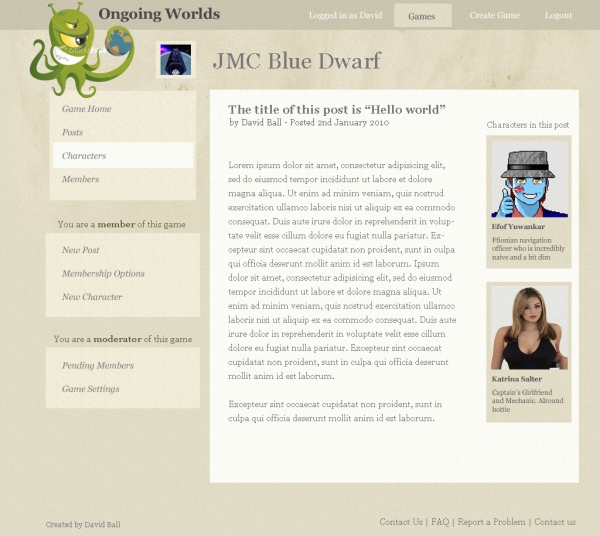
Here’s the design I’ve come up with:
This design currently shows the “View Post” screen, allowing you to view a story post that you or someone else has posted.
The options on the left are all related to the game you’re currently in (the example game here is called “JMC Blue Dwarf”). The images and text in the subcontent on the right of the page are characters summaries, these link to the character’s full profile. These are showing up here because someone has “tagged” them in this post (more tagging characters in posts in my previous article).
Please let me know what you think of the design, and if you can spot anything which you think won’t work, please let me know.


